Melectic – Logo Design

At Naimeo we sell website brand name packages. Complete with a logo and URL.
A melee of eclecticism is at the heart of this name. Melectic captures the youthful spirit and freeform approach of a flexible, agile and slightly anarchic organisation, where chaos and free-thinking rules. Perfect for a revolutionary and disruptive brand that’s ripping up the rule book with a creative new approach.
Designing logo’s for Naimeo is an amazing challenge. The focus of Naimeo is selling the name. The logo is an extra. That’s why every logo needs to feel generic and should fit in with nearly any company.
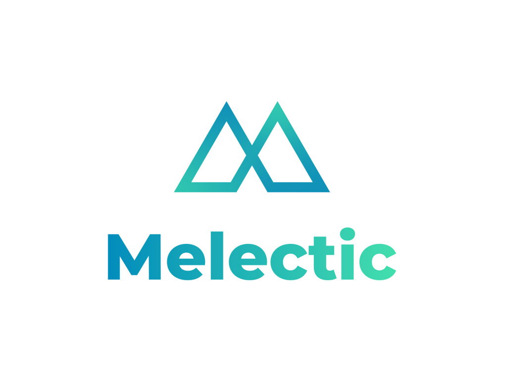
When making the Melectic Logo Design we took a look at how the name feels. Melectic feels electric, modern and strong. That’s why the logo symbolises two mountains, with a sleek and modern design. The crossing of the mountains make it feel like a digital icon, like bluetooth etc.
Ofcourse the logo also looks like the M, representing the name even more.
A simular logo, that also represents mostly the same energy is Inalitix.
The colours of the logo also fit into the story of a strong, electric and modern logo. The blue tints are often associated with online media, think Facebook and Twitter. The fade is a modern design trend that makes the logo and icon pop out in a world of single coloured logo’s.
For the logo’s font I picked a simple and modern font that gives off the same strong energy as the logo itself.
Overall I am very happy with the Melectic Logo Design. I hope that whoever buys the name will choose to use the logo with it. Otherwise they can always contact me for a logo that fits their company better.


