Copy Koffie – Logo

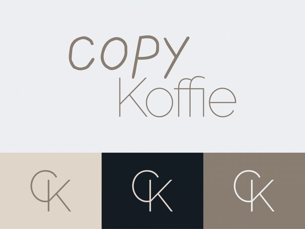
My sister just started her own freelance copy writing business and she let me help her with the design part of the business. The first thing every good business needs is a good logo. My sister wanted a simple wordmark as the logo for Copy Koffie. We took the fonts that she has used for her Instagram to create the wordmark. For a good wordmark I took the time to play with the curning on the font. This means changing the spacing between letters. This is done because it makes the logo feel more as one.
At first my sister only wanted a wordmark, I always advice to also get a small icon alongside the wordmark. Just like I’ve done with the Binnens Huis logo. A wordmark doesn’t fit in social media icons and doesn’t work as a favicon. This is the small icon in the top of your webbrowser.
Creating an icon or lettermark reflecting Copy Koffie was difficult, putting the letters CK together makes people instantly thing of Calvin Klein. In the end we put together a great Icon merging the two letters into one. This makes the logo clearly different from the Calvin Klein logo.
This project was absolutely great to work on, even though it was a small assignment we got to work on a lot of great things. And it resulted in a great logo for Copy Koffie.


