Syriously – Menu design
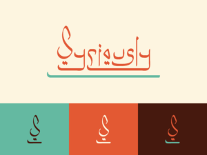
With all the design work done for Syriously also came making a fantastic menu. This Syriously menu design was done in line with the brand guide we had made for them earlier.
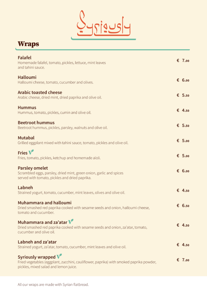
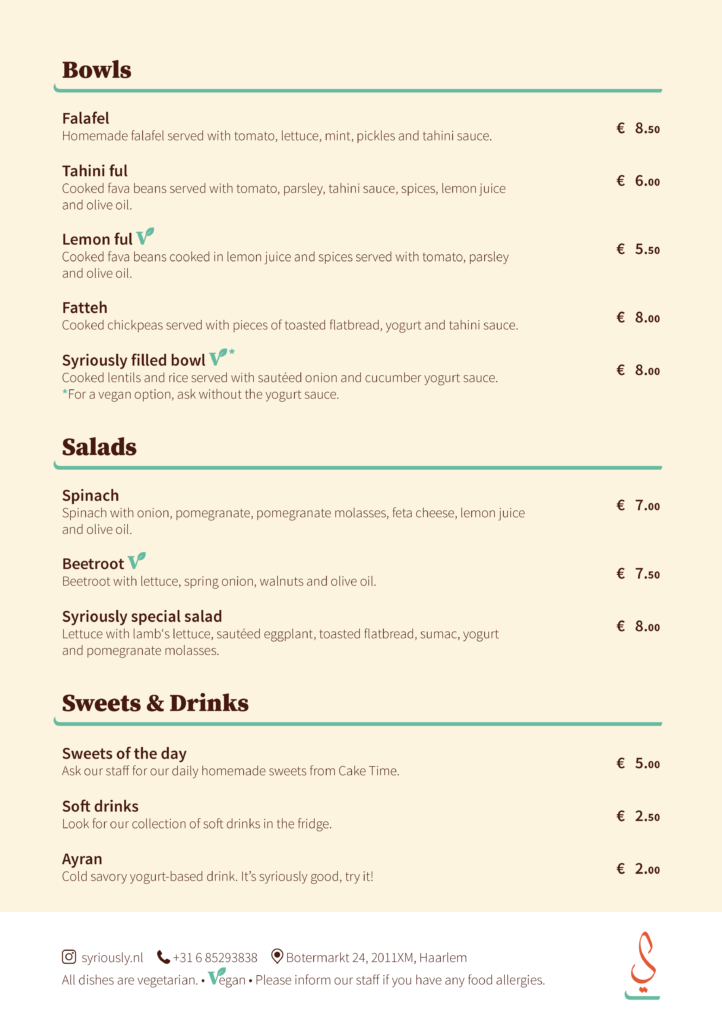
For the menu I took the elements created for the logo as underlines for the different sections. I used the brand guide for guidance on how to use the type face.
Since the restaurant owners made the prices simple I made sure the font reflected that. By having the cents in a smaller font.
At the bottom of the menu important information is highlighted in white. At the back of the menu this same style is used for the other information like location, instagram and phone number.
Since most of the menu is vegan, we wanted to also highlight the dishes that are vegetarian. We choose to do this with an icon we created our selves. Using the V of the Serif font and a leaf element for a clear indication that jumps at you. The vibrant green found in the logo and brand guide was perfect for the Vegan logo. Making the whole element feel included.
The tekst itself is all in a deep brown, making it easier on the eyes to read, especially with the beautiful contrast of the beige.

