Apple Haarlem – Logo Design
When working for apple, I got great opportunities to help doing internal design for one of the most recognisable companies in the world. I’ve had the pleasure to design an internally used logo for the apple Haarlem store.
To design this logo I had a close look at all other store logo’s apple has created. Because these logos all follow a set of guidelines.
- Be recognisable. [The logo needs to be recognised as an apple logo as soon as you see it]
- Stay (mostly) within the lines. [To keep the shape of the apple, most logos stay within the lines oft original logo, or slightly outside of it.]
- Pay honer to the city. [There is an apple store in most of the biggest cities in the world. The logo for that store needs to represent the city that its in.]
Honer to the history of Haarlem
The store logo for Amsterdam shows the characteristic houses of Amsterdam. The store logo of Barcelona shows the tiles designed by Gaudí that are seen throughout the city.
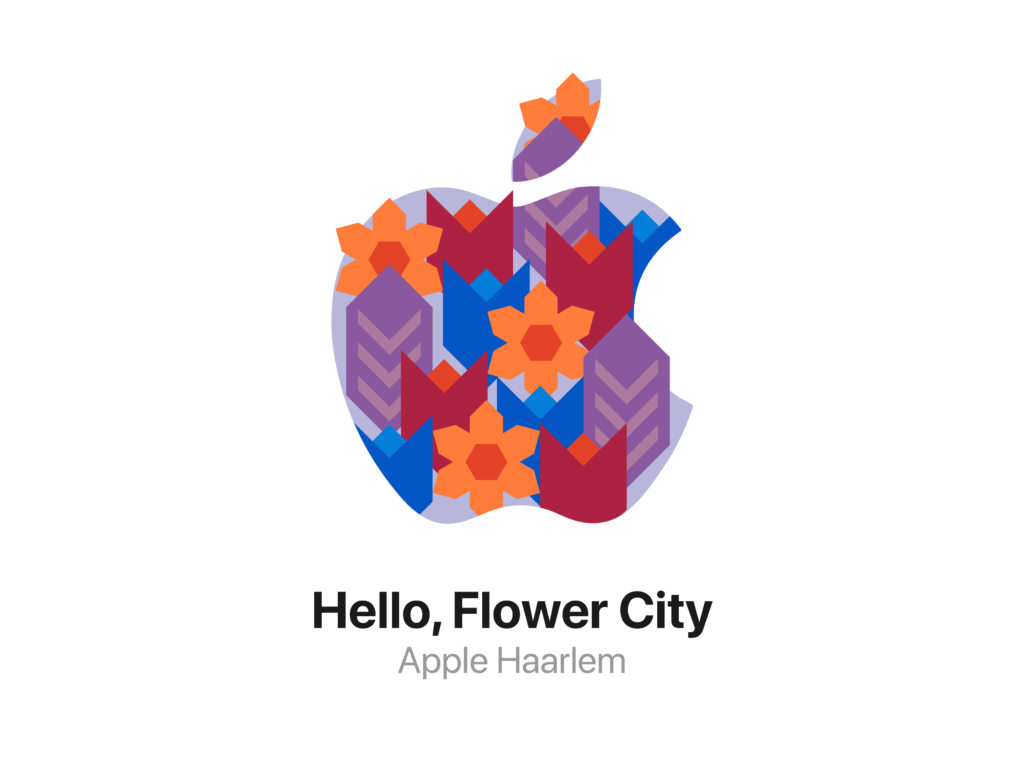
For the Apple Haarlem logo, the design also needs to honer the city of the store. So I took to the history of this city to see what would fit this logo. I decided on flowers.
Haarlem is known as the flower city. Being close to many of the places where the world-famous dutch flowers get farmed. And being final city of the Flower Parade. There is a big history of flowers in this city, and that is definitely something worth to honer in a logo.
The logo

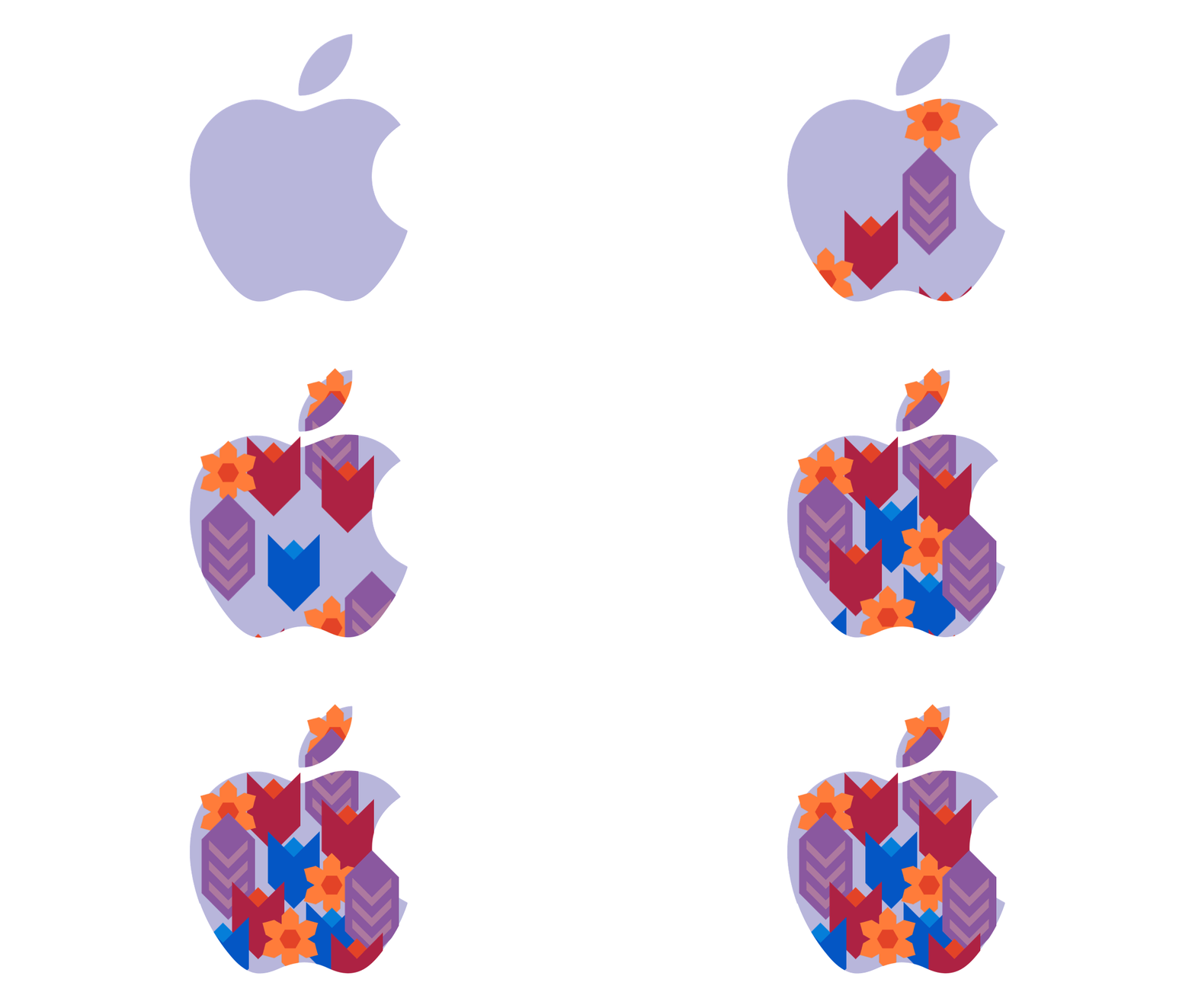
The final logo shows the beautiful spring flowers that are most often used in the flower parade. The color reflect the flowers themselves, and the local art of Haarlem.
Flowers are wild and will never be controlled fully, so of course they will grow, ever so slightly, out of the logo.
The use
The logo has been used for many internal events, posters, emails etc.
Unfortunately I am not able to show any of them for privacy and security reasons. But rest assured, the logo comes to its full power in all of them.


