FoodRoots – Branding
FoodRoots is team of students from the Netherlands, that is designing a way to show the impact of food products on sustainability.
This is done by collecting data on the environmental and social aspects. These data are combined into a final sustainability impact score which is printed on the food packaging.
A score like this needs good branding behind it. A good logo that you can recognise from far away. This logo needs to show people that they are doing something good for earth.
That’s why FoodRoots approached me to help them with the FoodRoots Branding.
This is how their logo came to be:
Round 1 – Shape Exploring

In the first round of creating the logo I presented 9 unique logo’s to the client. All representing their business in different ways. Here are the explanations, going left to right:
- This logo hints at the technology used by the FoodRoots team “Tangle”.
- Here I tried to represent the growing of information in a semi organic shape to show nature.
- The third logo is another reference to the “Tangle” and growing of information.
- With this logo I leaned into the organic shape which showing green growth.
- This logo tries to represent the “Tangle” again, this time in form of an organised knot.
- A clear hint to the splitting of cels, showing nature and the expansion of information.
- Hinting to Ying Yang, the balance of out planet. Making it 2 dark shapes to make it an earth with continents.
- With this blooming flower I tried to connect to brand to nature. Making it more modern and dotted to show the digital information again.
- Again, a hint to the splitting of cels, this time in form of two drop shapes.
After going over the first round of logo’s the founder of FoodRoots gave some great feedback on the logo’s, saying which ones jumped out and why. This clear feedback helped me narrow the logo’s down and then redefine them.
Round 2 – Colour Branding
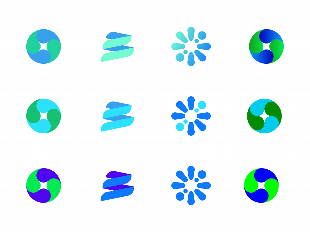
In round 2 the colours gave the client a better idea of what their logo could turn out to be. The most right logo in the middle row has another subtle change, a quarter turn, this gave the log more of a planet feel with the continents.
The favourite logo shape was narrowed down to the Ying Yang planet. The simplistic nature of the logo makes it instantly recognisable. This was very important for the team since it would be printed on food packaging.
Out of the six colours that I presented the logo with the slight turn was their favourite color combination. This because the logo has best contrast and colours that are easy on the eyes.
The team also liked the faded colours but in the end I advices against it since its not easy to print good fades.
Round 3 – Fonts and presentation
Logo presentation options:

Alignment of a logo and text never has to be in just one way. It’s always a good idea to have at least two ways to display the logo, a horizontal and vertical option. That’s why the client choice the first and second option shown here.
Font options:
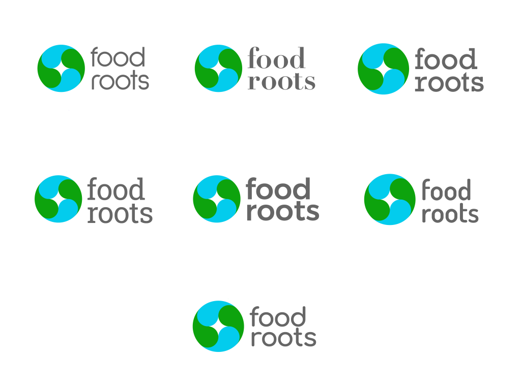
You can go a lot of direction when looking at fonts. So here we have a few that go in totally different directions, to give the client a good idea of what works and what doesn’t.
Some of these fonts have strong contrast between the rounded logo and the angled font. Or the modern simplistic logo and the more classic font. This can be great to stand out however can also make your font more controversial. The client here choose the last font as shown above. This would best fit the FoodRoots branding because of its kind curves.
Final Product
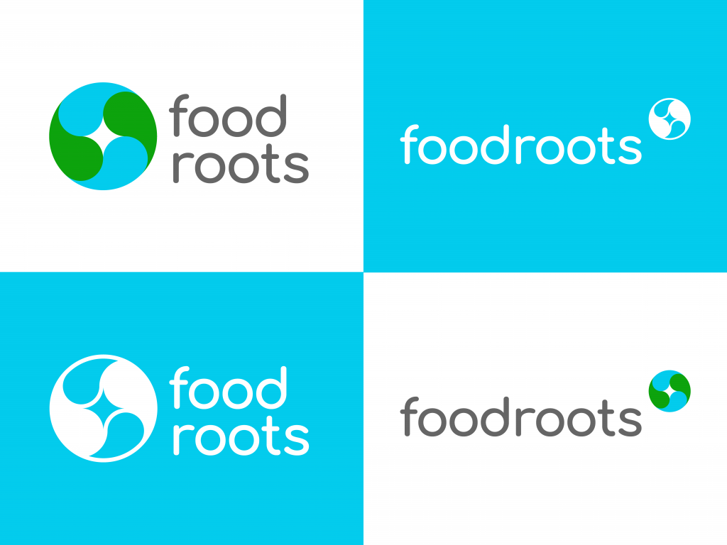
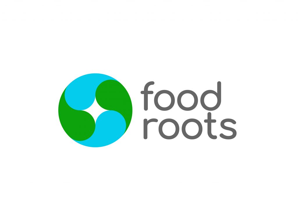
The final product shows everything the client wanted from this branding project. Firstly it shows our green planet that FoodRoots aims to keep green. Along with our planet the logo also shows the Ying Yang, or good and bad that we have to balance to keep our world healthy. The logo is clearly visible in an instance making it the perfect logo to recognize.
Client feedback:
It was great to work on the Branding of the FoodRoots logo. The client had great feedback and the project came along swiftly. Here is what the client had to say after;
Mathijs heeft het logo en de stijl gids ontworpen voor FoodRoots. In zijn werk gaat Mathijs goed om met de input van de klant. Hij heeft onze visie goed kunnen vertalen in de ontwerpen.
Thomas Fransen – Founder Foodroots

